MIAD - Screen Printing
|
Title: Diverse
Size: 91.44 x 91.44 cm Medium: Photoshop and Silk Screen Completion: October 2018 Title: Harmony
Size: 91.44 x 91.44 cm Medium: Photoshop and Silk Screen Completion: October 2018 |
Exhibition Text:
“Diverse” and “Harmony” were made in order to express a feeling of a happiness within a community. I got inspired by Oswaldo Guayasamin and Dr. Odita in order to create these pieces. These pieces were made to show that setting aside our differences, we can all come together to make something better. Oswaldo Guayasamin and Odili Odita were my inspirations for these pieces as they tend to center their art around diversity. “Diverse” and “Harmony” were created using Photoshop CS6 and silk screening.
“Diverse” and “Harmony” were made in order to express a feeling of a happiness within a community. I got inspired by Oswaldo Guayasamin and Dr. Odita in order to create these pieces. These pieces were made to show that setting aside our differences, we can all come together to make something better. Oswaldo Guayasamin and Odili Odita were my inspirations for these pieces as they tend to center their art around diversity. “Diverse” and “Harmony” were created using Photoshop CS6 and silk screening.
Inspiration:
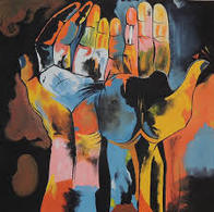
“Diversity Hands by Oswaldo Guayasamin – Presbyterian Women.” Presbyterian Women, www.presbyterianwomen.org/2017/09/05/in-times-of-uncertainty/gods-hands/.
|
Ohio State University Office of Diversity. “Office of Diversity and Inclusion Hale Black Cultural Center.” Art Collection | Hale Black Cultural Center | Office of Diversity and Inclusion, odi.osu.edu/hale-black-cultural-center/art.html?iid=153.
|
I took inspiration for both artworks from “Diversity Hands” by Oswaldo Guayasamin. Guayasamin created this piece in 1982 in order to represent the obstacles he had to face when he was younger and how he got through them by expressing his pain through his artwork. Throughout these pieces, we had to represent our community, which in my case, was Milwaukee. I decided to center my art around diversity. When I started creating my artwork, I already had an idea of what I wanted to make and I felt that “Diversity Hands” was a good representation of that. This piece focuses on a color scheme to represent a diverse feeling. The artists used many undertones and shades in order to achieve this.
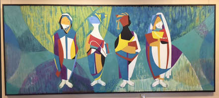
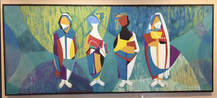
I also took inspiration from Odili Donald Odita “In Unity There Is Strength”. Dr. Odita created this piece in order to represent the obstacles that she faced throughout time. Odita is an abstract artist who likes to experiment with color. When I was making my piece I had in mind that I wanted to do create something similar to Odita’s piece. Odita used people and color scheme in order to get her point across. I decided to use fists instead of people in order to get my point across. I wanted to represent diversity and unity with this piece. I decided to also use Odita’s color scheme as she experimented with colors in order to get diersity to play a factor in her art.
I also took inspiration from Odili Donald Odita “In Unity There Is Strength”. Dr. Odita created this piece in order to represent the obstacles that she faced throughout time. Odita is an abstract artist who likes to experiment with color. When I was making my piece I had in mind that I wanted to do create something similar to Odita’s piece. Odita used people and color scheme in order to get her point across. I decided to use fists instead of people in order to get my point across. I wanted to represent diversity and unity with this piece. I decided to also use Odita’s color scheme as she experimented with colors in order to get diersity to play a factor in her art.
Planning:
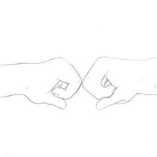
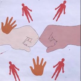
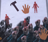
Sketch 1: This is the design I decided to move forward with for my first background as I believed that it did a great job in getting my point across. The two fist were meant to each be painted with a lighter and darker shade in order to symbolize unity in my community. This sketch was meant to show how no matter the differences there is within a person, that doesn’t change the fact that we can all come together to create a positive impact in our community.
|
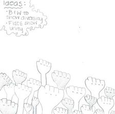
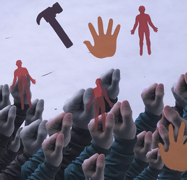
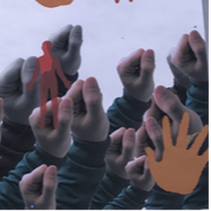
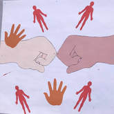
Sketch 2: This is the design that I decided to move forward with for my second background as I believed it did a great job of spreading a feeling of diversity and unity. The fists were meant to be placed in different sizes, black and white, and color in order to show unity asides from differences that I have seen within my community.
|
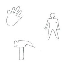
Sketch 3: These are the three designs that I decided to move forward with for my stencils. Each stencil was made in order to express a feeling of unity and diversity. The hand was meant to be placed on my background with many colors to indicate that diversity was present within my piece. The hammer was made in order to be placed in my background to show equal labor within a community. Lastly, the person was made in order to symbolize unity and diversity, this stencil was meant to be printed on both backgrounds in different colors.
|
Process/Techniques:
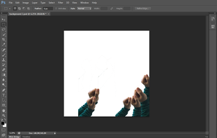
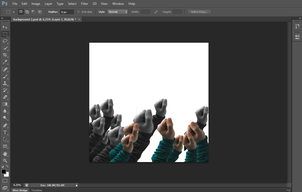
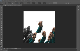
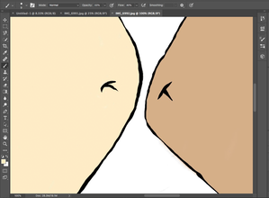
Step 1: I started by creating a blank document that measured 36 x 36 inches with a resolution of 200. After this, I clicked File and opened my picture of the fist I had taken, and I used the Lasso Tool in order to cut out the fist. Afterwards, I continued to paste fists onto my document. To change the size of the fist I clicked on Edit + Transform + Scale, similarly, to rotate my image and get a better placement, I clicked on Edit + Transform + Rotate.
|
Step 2: Once I placed my fists and scaled them the way I wanted, I decided to play with the layers in order to apply a black and white layer to add dimension to my piece. I clicked Adjustment + Black and White in order to add a black and white layer. This allowed half of my piece to be black and white while the other half included color.
|
Step 3: I decided to Copy + Paste a lot of fists into my black document in order to place them where I wanted to so that I could get an idea on how I wanted to change it up later. I used the Rectangular Marquee Tool in order to select each individual fist while also using the Move Tool in order to place my images in whichever area I desired.
|
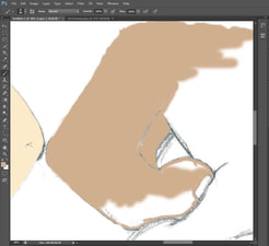
Step 1: I started by creating a blank document that measured 36 x 36 inches with a resolution of 200. After this, I clicked File and opened my scanned drawing. I then used then selected the Brush Tool in order to start painting my piece. I used the Color Pad in order to find a perfect light and dark colors for both my fists.
|
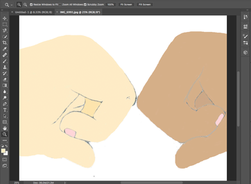
Step 2: As soon as I had found the perfect color for my piece, I selected the Brush Tool and set my brush size to 14 and started to paint the fists making sure to stay in the lines.
|
Step 3: Since I noticed that my piece was looking very dull and it had lost all of its definition, I decided to outline my image to add back it’s definition. To do this I selected the Brush Tool + set the Color pad color to black. I used the Zoom Tool in order to zoom in and get a more precise outline.
|
Step 4 (both pieces): Once both my pieces were done they were printed on Tyvek. I traced my stencils onto freezer paper and cut the out using scissors. My class and I then made a trip to MIAD and we used their printing facilities in order to complete our pieces. I taped my stencils onto my silk screen and placed my ink all over the screen. I applied pressure onto the silk screen in order for the ink to transfer onto my background. Once all my ink was pulled of the silk screen, I removed it and repeated the same steps for my remainings stencils.
Process:
Collecting Images:
|
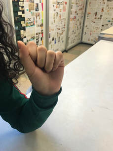
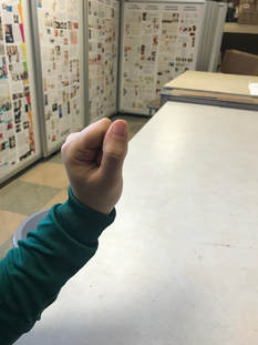
To get the best outcome for my pictures, I figured that I wanted my picture to have a great outcome with high quality. I figured that it was best if I were to ask one of my friends if she could hold her hand up in a fist so that I was able to to take pictures with different angles. The picture on the left wasn't at the best angle because I wanted to make sure that there was a great outline of a fist. This picture wasn't the best suiting for my piece. I started playing with angles and I finally decided that the picture on the right would be the best picture to move forward with because it was at a good angle and it was taken in natural lighting with would avoid any shadows showing up on her fist.
|
|
Experimentation:
|
As soon as I integrated the Brush Tool to color in my background I saw that the balance in my image was diminished, therefore, I decided to go back in with the Brush Tool + a black hue from the color pad in order to ass more dimension into my piece. The pieces by Guayasamin and Odita were both very defined with line and I wanted to integrate this into my piece. It was very hard to draw straight lines along my drawing without making some lines thicker than others. I also wanted to make sure that my background was the main emphasis of my finished piece since that’s the part that contains the most meaningful content. I believe that If i would’ve been able to zoom in more with the Zoom Tool without it getting too pixely, my piece would’ve had a better linear perspective.
|
|
Working with a silk screen on Tyvek was one of the biggest challenges I faced throughout this project. When I starterted printing, I noticed that I added too much ink on my silk screen therefore it was very hard for me to get a print with a good proportion on ink all throughout. While printing I payed minimal attention to the scale of my image and that’s why it came out crooked and had bad placement in my piece. Once I pulled back my ink and removed my silk screen the texture of my print seemed to be very thick and messy. My goal was to use complimentary colors throughout my piece using the same stencil but this was very hard to do. We had a limited amount of time to finish our piece and in order for us to use different colors, we would have to wait for the previous color to completely dry which took a lot of time. I believe that I would’ve made a lot of stencils I wouldn’t have had this problem and I would’ve actually been able to go forward with my idea of having one stencil in various colors.
|
|
Critique:
|
Similarities:
~ All pieces were intended to express a feeling of unity and diversity by using line perception to create balance within the pieces.
~ All pieces go in contrast from light to dark hues. ~ Pieces were intended to use complimentary colors in the color wheel in order to create contrast between each object in each piece. |
|

|
Differences:
~ Guayasamin's piece includes darker hues unlike my piece which includes warmer hues to create contrast.
~ Odita’s piece mainly focuses on the context of feeling united while my piece symbolizes diversity, unity, and positive change. ~ Guayasamin’s and Odita’s pieces both include many different colors in their pieces while I only integrated complementary colors in order to show contrast. ~ Odita’s piece doesn’t use any line while I decided to integrate line in each piece to create contrast between all objects in the piece. |
Reflection:
Overall, I was pretty pleased with my piece and it’s integration of context, line perspective and color. I took inspiration from Oswaldo Guayasamín and Dr. Odita in order to give value and meaning to my piece. My pieces has some similarities and some differences to Guayasamin’s and Odita’s piece such as its’s meaning. The meaning behind these pieces was to show unity and diversity within our community. These pieces also intended to use complimentary colors in the color wheel in order to set a contrast between each object. Some differences between these pieces would be that Guayasamin’s and Odita’s pieces contain various colors in order to create emphasis in one specific area while my piece mainly contains warmer colors in order to show contrast. Something I would change within my piece would be the fact that I didn’t make many stencils, therefore, I was limited to the amount of color I could integrate into my piece.
ACT Questions:
1) Clearly explain how you are able to identify the cause-effect relationship between your inspiration and its effect on your artwork.
After learning about Oswaldo Guayasamin’s and Dr. Odita’s perception on equality within a community I decided to integrate unity and diversity into my piece.
2) What is the overall approach the author has regarding the topic of your inspiration?
The artists main focus was to center their pieces around equality and how this could make a positive change within a community. To do this, they decided to integrate shape, line, and color into their pieces to emphasize their main idea. I used this as inspiration in order to get a result in which the viewer could look at my piece and focus on it’s meaning by reflecting on the emphasis of the colors that were used.
3) What kind of generalizations and conclusions have you discovered about people, ideas, culture, etc. while you researched your inspiration?
I discovered how integrating many elements of art in your piece could really interfere with the meaning it’s trying to portray. Whether your piece includes texture, line, different hues, these elements would all come together and give your piece a different context and viewpoint.
4) What is the central idea or theme around your inspirational research?
I wanted to interpret my community and how there is lots of unity and diversity shown everywhere you go. Similarly to Guayasamin’s and Odita’s pieces, I wanted to integrate the perception of equality that you can find within a community. To achieve this, I added lots of color and provided a light and dark contrast.
5) What kind of inferences did you make while reading your research?
Integrating different elements to piece could really change its meaning. When I first started to look at Odita’s and Guayasamin’s pieces I interpreted them differently but as soon as I researched their meaning I found out that they had a very strong meaning behind them. This is something I took in mind while making my pieces as I wanted to make their meaning easy to understand.
Bibliography:
“Diversity Hands by Oswaldo Guayasamin – Presbyterian Women.” Presbyterian Women, www.presbyterianwomen.org/2017/09/05/in-times-of-uncertainty/gods-hands/.
Ohio State University Office of Diversity. “Office of Diversity and Inclusion Hale Black Cultural Center.” Art Collection | Hale Black Cultural Center | Office of Diversity and Inclusion, odi.osu.edu/hale-black-cultural-center/art.html?iid=153.
Grass, ByKacper. “Life and the Human Condition through the Eyes of Oswaldo Guayasamín.” DailyArtMagazine.com - Art History Stories, 8 May 2018, www.dailyartmagazine.com/oswaldo-guayasamin-art/.
Tonguette, Peter. “Arts: Buried Treasures from OSU's Hale Black Cultural Center.” Columbus Monthly, Columbus Monthly, 15 Aug. 2017, www.columbusmonthly.com/lifestyle/20170815/arts-buried-treasures-from-osus-hale-black-cultural-center.
